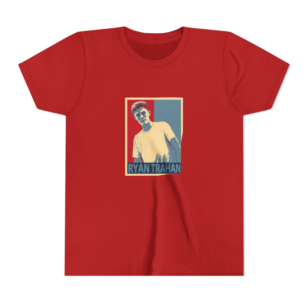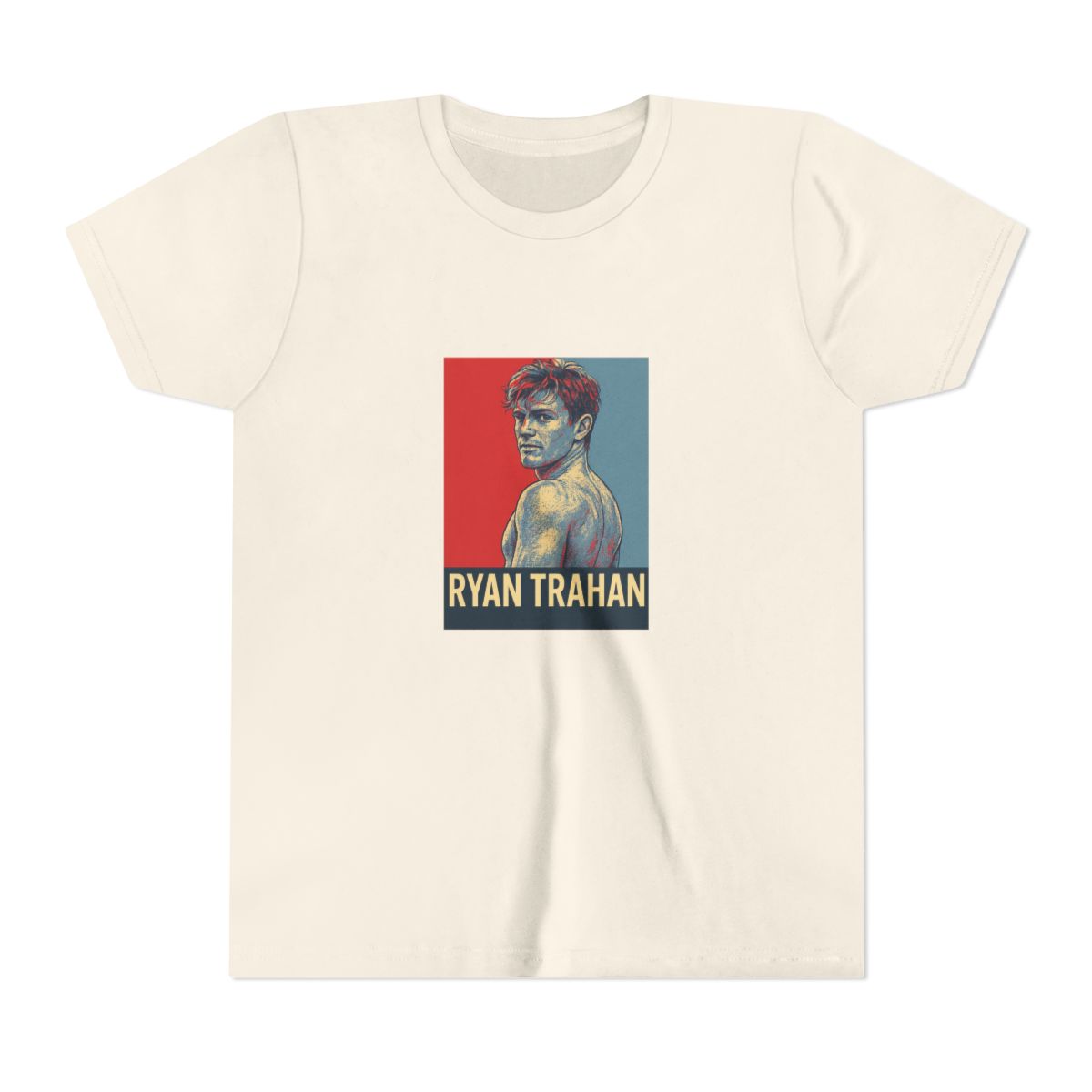
Iconic Penny Challenge Designs Explained
Dive into the heart of the Penny Challenge with designs that capture Ryan Trahan's wild journey. Picture a bold penny graphic exploding across the chest - it nods to starting with just one cent and turning it into an epic cross-country quest. These aren't random prints; each one pulls from real moments like hitchhiking thrills or motel mishaps that fans replay on loop.
Take the 'Survive on a Penny' script arched over a rugged map outline. It screams determination, reminding wearers of Ryan's grit in flipping that single penny into meals, rides, and shelter. Another standout features a cartoonish backpack stuffed with challenge essentials, complete with a tiny penny peeking out - pure fun that sparks conversations at every meetup. Fans geek out over the subtle details, like hidden state icons tracing the route from Oregon to Maine.
These designs go beyond merch; they embody the hustle. Ryan's team crafted them with vibrant inks that pop on dark fabrics, ensuring the Penny Challenge vibe lasts wash after wash. Whether it's the minimalist penny stack or the chaotic 'Next Stop World' tagline, each piece tells a story of impossible odds beaten.